
AMD Design language
Data Center + AI
What is a design language?
A design language is a comprehensive system of visual elements, principles, and guidelines that define the look and feel of a brand or product, ensuring a consistent and recognizable brand experience. It’s a framework to help creatives develop a unified and cohesive visual experience, ultimately contributing to brand strength.
Solutions: Strategy, Creative Direction, Design

The goal of the design language
Create visual unity
A design language establishes a common visual thread across all brand expressions, from product interfaces to marketing communications. By aligning elements such as color, material, and shape, it ensures every touchpoint feels unmistakably AMD—cohesive, intentional, and connected.
Balance execution and rules
While brand guidelines define the foundational elements of identity—logos, voice, tone—a design language builds on them by offering practical systems for applying these elements creatively. It serves as a bridge between rigid rules and expressive execution, enabling more nuanced design choices without compromising brand integrity.
Elevate creative output
With clearly articulated principles and reusable components, the design language empowers creative teams to work faster and smarter. It fosters innovation within a structured system, encouraging bold, refined storytelling that reflects AMD’s forward-thinking vision while maintaining consistency and quality.
Creative Framework
There is no single visual formula for creative expression at AMD—instead, we operate on a dynamic spectrum. Based on the marketing strategy, we move from conceptual storytelling to hyper-realistic renderings. The nature of the content ranges from focused product narratives to expansive industry and data center solutions. This flexibility ensures our visuals are always tailored to the message and audience, not confined to a one-size-fits-all aesthetic.
The design language provides a strategic framework—not rigid templates—empowering teams to adapt creatively based on where we are in the marketing funnel and what we need to communicate.

Color
Color is one of the most powerful tools in shaping brand perception—it sets the tone, evokes emotion, and reinforces identity. AMD’s color palette is intentionally minimal, centered around a bold contrast of black and white to convey clarity, strength, and precision. Strategic accents of Teal (#00C2DE) and Gold (#C1A968) inject vibrancy and sophistication, serving as moments of emphasis that highlight innovation and excellence. Used thoughtfully, this palette creates a distinctive and elevated visual experience that is unmistakably AMD.


Shape
Shape plays a critical role in expressing AMD’s identity, with a focus on straight edges and hard lines that convey precision, strength, and confidence. This design approach reflects the engineered rigor of our technology and echoes the sharp geometry of the AMD logo. While the system avoids overly organic or freeform shapes, it’s not about rigidity—it’s about intentionality. Every form has purpose and clarity, reinforcing a sense of control, performance, and modernity.


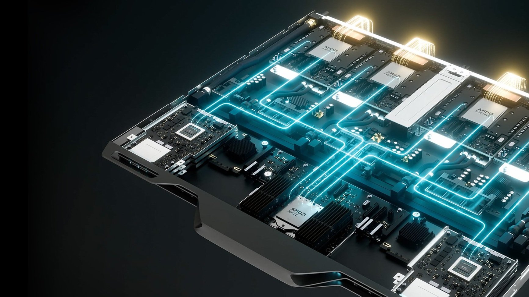
Material
Material serves as a visual connector across AMD’s storytelling, grounding our creative work in the physical reality of our products. By drawing from the textures, finishes, and surfaces found in our chips and systems—like brushed metals, etched silicon, or precision-machined components—we create a cohesive thread between abstract concepts and tangible technology. Whether depicting infrastructure, people, or ideas, material ensures our imagery feels authentic, premium, and unmistakably AMD. It’s a subtle but powerful way to unify expression and elevate realism across every touchpoint.


